We've made some improvements to dashboards, making it easier to display and interpret data that matters to you. Here's what's new:
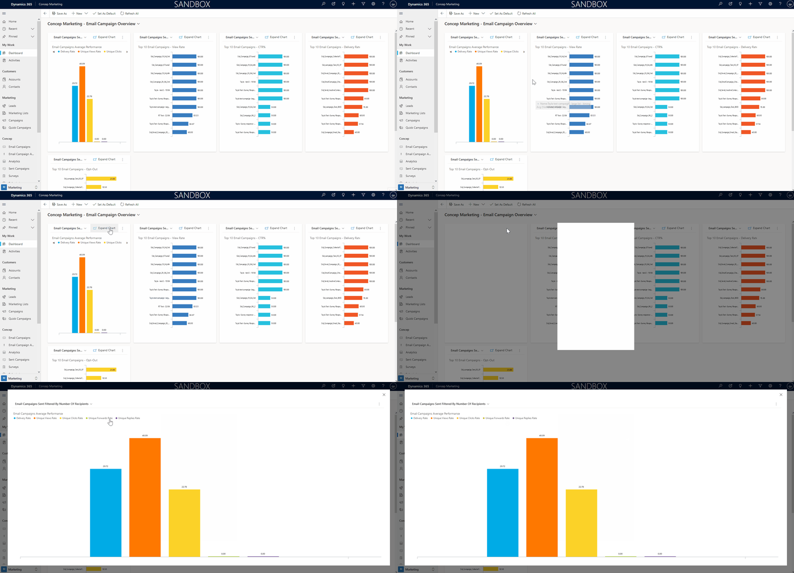
- Each chart is smaller
We've drastically reduced the size of each chart so that you can view each one at a glance without having to scroll so much. Don't worry though, there's an option to "Expand Chart" should you want to open one in a full screen pop-up:
- Interactive dashboards
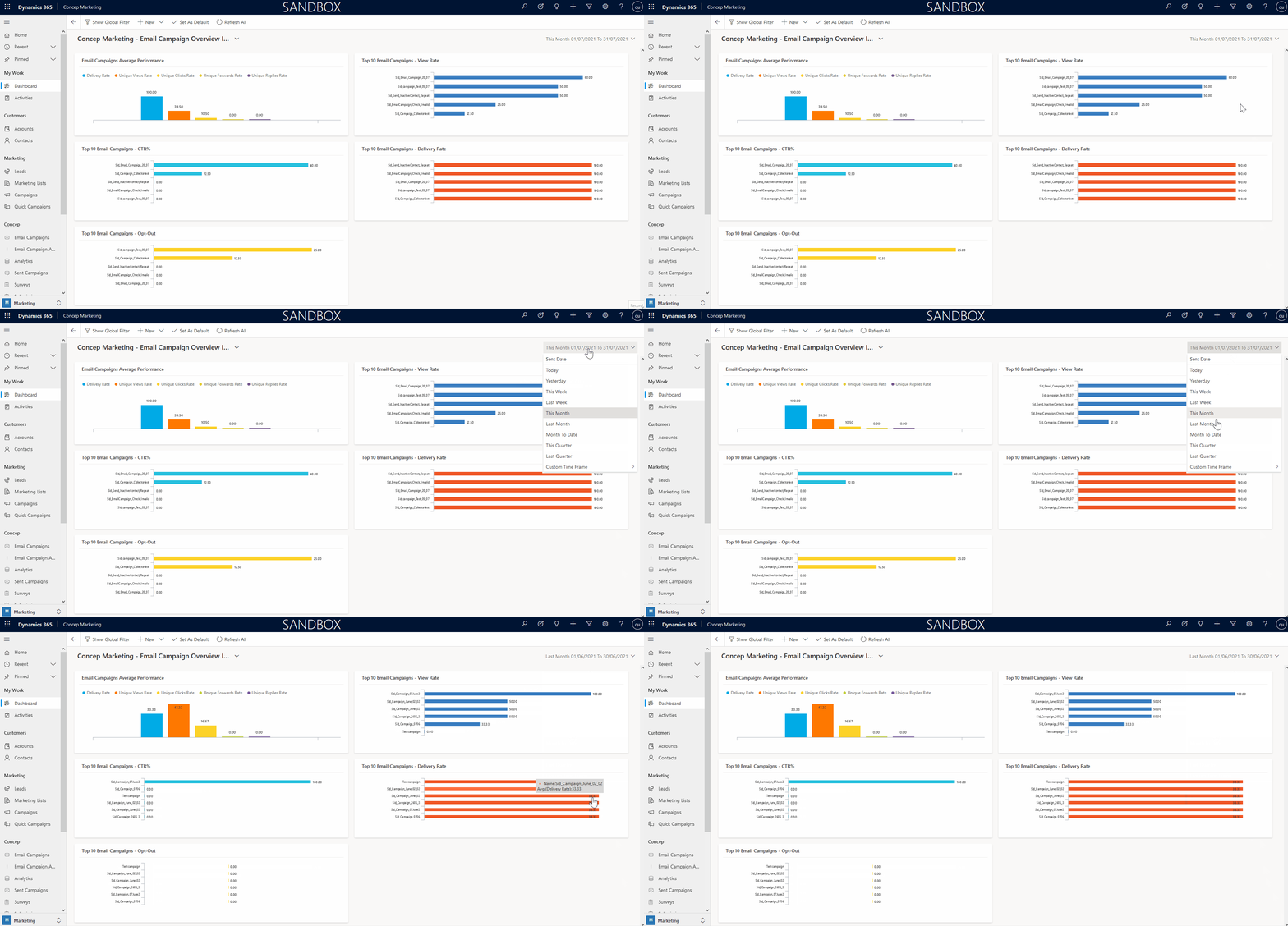
Via the "Concep Marketing - Email Campaign Overview Interactive" and "Concep Marketing - Client Engagement Interactive" views, you can now filter by date to display data across a certain time frame. Whether your KPIs are weekly, monthly or quarterly, you can adjust your dashboards to suit. You can even enter a custom date range, giving you full control over the data you want to display:
- Filter out test data
To ensure your dashboards aren't skewed by test data, by default, we now filter out email campaigns sent to less than 3 recipients. If you send tests to more than 3 recipients, let us know and we can adjust your configuration accordingly.

Comments
0 comments
Please sign in to leave a comment.