
Mobile-optimized design is for creating a single template with the usability and experience for both desktop and mobile in mind.
Best practice to achieve this includes:
- Template width 320-480 pixels wide (depending on the smartphone optimized for)
- Single-column layout
- Left-aligned content
- Large font sizes for viewing clarity e.g. 12/13pt
- Large call-to-action buttons (at least 44px in size)
You can check the mobile usage of your own recipient base in Concep Send via Report > Delivery > Email Clients. It is important to do this to gauge the true value a mobile template would bring to your company’s marketing.
Mobile email view rates of over 30% mean you should consider mobile-optimized design at a minimum.
Mobile-responsive Templates
Mobile-responsive design adjusts its layout depending on the email viewing platform, typically achieved using CSS media queries in one HTML file. Compared to mobile-optimized design, mobile-responsive design is the more advanced option.
CSS Media Queries
Mobile-responsive media queries and styling are included in the same CSS for the template’s standard desktop version:
| @media only screen and (max-device-width: 480px) { /* Styles */ } |
What this means is that the mobile-responsive styling (in /* Styles */) is ‘activated’ and displays the mobile-responsive version of the template when it is viewed on a device with screen dimensions 480 pixels or less i.e. mobile.
Best practice Styles include:
- Single-column layout
- Large font sizes for viewing clarity e.g. 12/13pt
- Large call-to-action buttons (at least 44px in size)
Please see the desktop and mobile views on the following page for an example of how mobile-responsive design will work for your template.
Mobile-responsive template: Desktop view
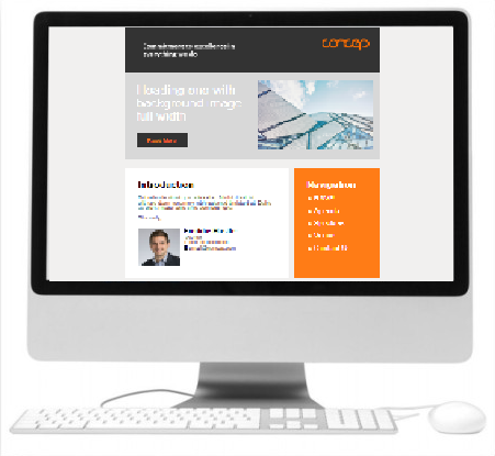
The smaller mobile screen width (320-480 pixels) has not been detected by CSS media queries, so the template is displayed as the standard desktop version, utilizing the full screen width for spread out content.
Mobile-responsive template: Mobile view
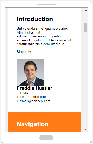
The mobile screen width (320-480 pixels) has been detected by CSS media queries, so the template is displayed as the alternate mobile version; the view is adjusted to a single column layout, and text enlarged for better readability.
Comments
0 comments
Article is closed for comments.